
Movement Guide
International Gothic
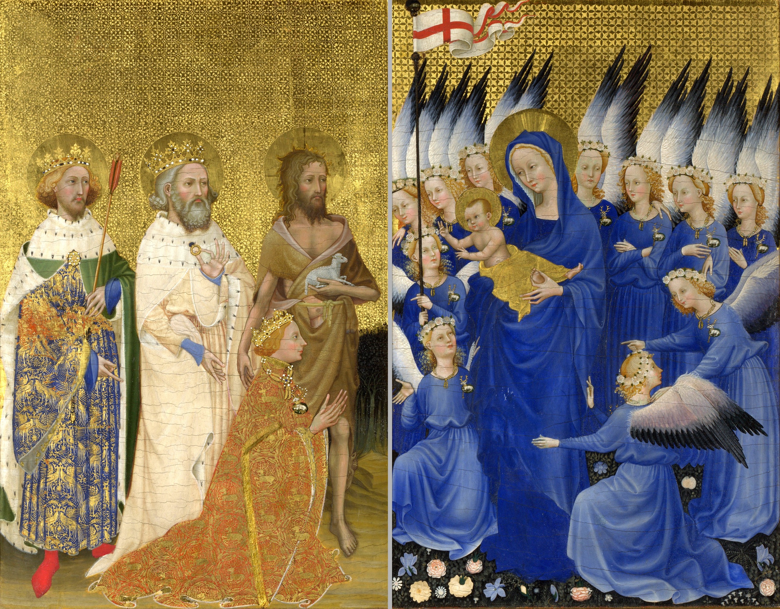
International Gothic turns late medieval court culture into a language of gold, elegance, and portable prestige. Its figures are graceful, its surfaces luxurious, and its details often sharper than its spaces. It is not a primitive step before the Renaissance. It is a refined court style built for devotion, diplomacy, rank, and visual pleasure.
The National Gallery defines the term as a kind of courtly painting created across Europe from the late 14th to the mid-15th century. The word "international" points to the movement of styles, artists, manuscripts, objects, marriages, and diplomatic gifts among courts. Paris, Prague, Milan, Burgundy, England, Bohemia, and northern Italy could share visual habits while keeping local differences.
What defines it
- Elegant, elongated or softly idealized figures.
- Rich color, gold grounds, gilding, and decorative surface effects.
- Courtly refinement, often linked to royal, aristocratic, or elite devotional use.
- Natural details such as flowers, animals, textiles, and jewels, even when space remains illogical.
- Portable media: diptychs, manuscripts, small panels, luxury objects, and images made for intimate handling.
Court style, not one national school
International Gothic is hard to pin to one country because that is part of its nature. Court culture crossed borders. Patrons married across dynasties, books traveled, artists moved, and luxury objects carried visual ideas from one center to another. The result is a style that can look French, English, Bohemian, Italian, or Burgundian without belonging neatly to only one place.
That mobility makes the Wilton Diptych difficult to localize. The National Gallery identifies its painter as English or French. The uncertainty is not a failure of scholarship; it reflects a world in which courtly style was deliberately shared. The painting's blue, gold, soft faces, flowers, and precise emblems speak the language of elite Europe more than the language of one workshop address.
The Wilton Diptych as a key example
The Wilton Diptych shows International Gothic at its most compressed. It is small, portable, luminous, and loaded with court signs. Richard II kneels before the Virgin and Child; saints present him; angels wear his white hart badge; gold fills the heavenly panel. The image is devotional, but every devotional detail also carries rank.
The style makes power look delicate rather than brutal. Richard's claim is not made through battle, architecture, or mass spectacle. It is made through ceremonial refinement: embroidered pattern, badges, saintly mediation, and the preciousness of the object itself. International Gothic often works this way. It can turn authority into grace, and grace into authority.
How to look at International Gothic
Begin with surface. Gold, blue, patterned textiles, stamped decoration, and jewel-like detail are not secondary luxuries. They are how the image thinks. Then look at bodies. Figures often stand or kneel with elegant restraint, less interested in physical weight than in status, devotion, and courtly poise.
Next, look for contradictions. A flower may be observed with great precision while the whole space remains unreal. A face may be tender without becoming individualized in a modern portrait sense. A sacred scene may include badges, heraldry, and family symbols. International Gothic is not confused by these mixtures. It thrives on them.
Between medieval image and Renaissance space
The movement sits between earlier medieval systems and later Renaissance naturalism. Compared with Romanesque, it is more courtly, more delicate, and more invested in surface luxury. Compared with the Early Renaissance, it is less committed to stable perspective and bodily mass. Its strength lies elsewhere: in ceremony, decoration, symbolic density, and visual intimacy.
A comparison with the Book of Kells Chi Rho Page clarifies the shift. Kells makes sacred reading dense through pattern and script. International Gothic makes sacred and political identity shine through courtly display. Both slow the eye, but they do it with different tools.
What the movement reveals
International Gothic shows late medieval Europe as connected, mobile, and visually sophisticated. It also corrects a common timeline mistake. The years around 1400 were not merely waiting for Renaissance perspective to arrive. Courts were developing a different kind of visual intelligence, one based on portable objects, refined surfaces, symbolic code, and the choreography of rank.
For Explainary readers, the style trains attention to power hidden inside beauty. A badge, a flower, a color, or a gold ground can look decorative at first, then reveal itself as part of a social and devotional system. International Gothic rewards slow looking because surface and status are inseparable.
Key works in Explainary
Comparison path
Then use the art quiz to test whether you can recognize courtly Gothic surface when medieval and Renaissance works are mixed together.