
Insular art
Book of Durrow - A Carpet Page
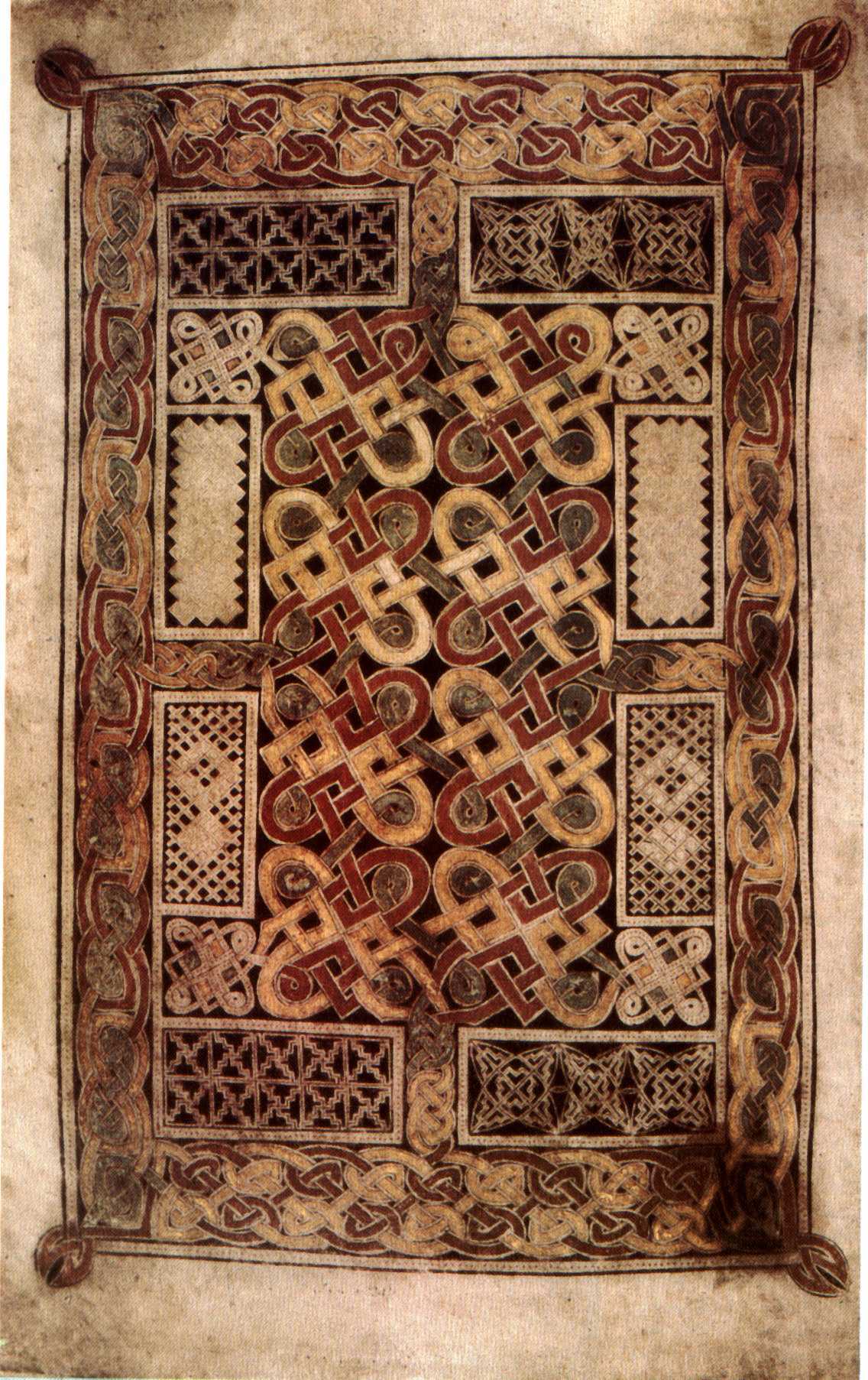
This carpet page from the Book of Durrow lets you see the grammar of Insular art before Lindisfarne tightens it and Kells pushes it toward spectacle. The page is early, compact, and highly ordered, which makes its visual logic easier to grasp than the denser pages that come later.
What this page is
This is one of several carpet pages in the manuscript: a full folio given over to ornament rather than narrative. It does not illustrate an event. It creates a pause before sacred text, asking the reader to slow down and enter the Gospel through pattern, symmetry, and repetition.
Durrow shows the system early, but not in a tentative state. The visual language is already coherent. If you want to understand how Insular manuscripts train the eye before they overwhelm it, this is where the logic stays easiest to see.
Where it comes from
The exact origin of the Book of Durrow is still debated. Scholars place it somewhere within the connected monastic world of Ireland, Iona, and Northumbria in the mid-seventh century. That uncertainty is part of its value: the manuscript belongs to a network rather than to a single isolated center.
Historically, the page stands near the beginning of the Insular sequence. It preserves a moment when Christian book culture, Celtic curvilinear design, and strongly framed ornament were being fused into a new manuscript language. Later works refine that language, but Durrow lets you see it before it becomes more elaborate.
The artistic language of the page
The page is built from containment. A broad outer border stabilizes the whole surface; smaller framed zones keep the eye moving in measured steps; a central knot of interlace gathers the composition inward again. Flat color, sharp contrast, and repeated modules make the folio feel more like a designed object than a window onto space.
That artistic restraint is the point. Durrow is not primitive because it is simpler. It is precise about where ornament begins and ends. The page teaches an aesthetic of rhythm, edge, and return. It has the severity of a diagram and the pleasure of a woven object at the same time, which is why it remains so satisfying to look at closely.
The makers' intention
The makers were not trying to fill the page for its own sake. The goal was to create a visual threshold before reading, one that would order attention rather than scatter it. This is early medieval art thinking through liturgy: pattern becomes a way of preparing the mind for scripture.
Durrow is especially good at making that intention visible. Because the pattern stays contained, you can see how the design regulates tempo. The eye moves around the frame, settles into the central field, and learns to accept repetition as a meaningful experience rather than a decorative surplus.
How to place it in the Insular sequence
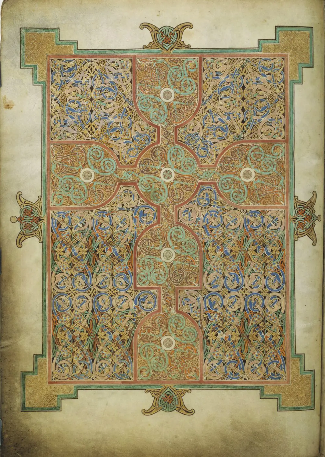
The next comparison is the Lindisfarne carpet page. Lindisfarne keeps the same devotion to pattern, but tightens the system into a more unified and more exact geometry.
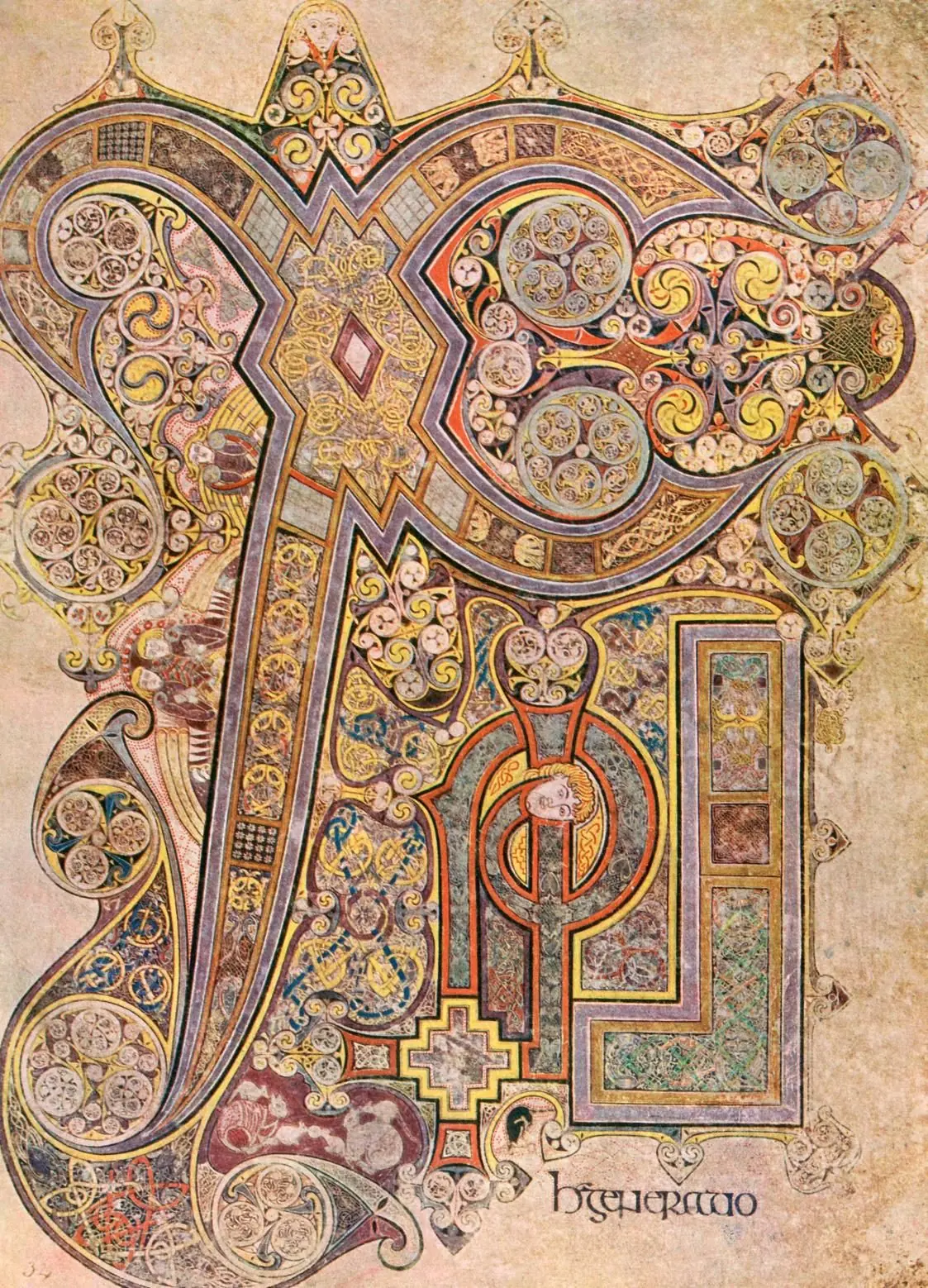
Then look at the Book of Kells Chi Rho page. There the page becomes far denser and far more theatrical. Seen after Durrow, Kells stops looking like pure exuberance and starts looking like a later, riskier expansion of the same Insular grammar.
Durrow names the essentials quickly: frame, knot, repetition, pause, containment. Once those are clear here, later Insular pages become much easier to read, especially alongside the Kells vs Lindisfarne essay.
A final step is to compare the page with the Ardagh Chalice, where a similar ornamental intelligence moves from vellum to metal. Then try the art quiz and see whether Insular pages now separate more clearly in your mind.
Explore more
Related Works
Primary Sources
- Trinity College Dublin Digital Collections — Book of Durrow
- Encyclopaedia Britannica — Book of Durrow
- British Library — Illuminated Manuscripts Catalogue
- National Museum of Ireland — Early medieval context
- JSTOR — Insular Ornament in the Book of Durrow (Nordenfalk)
- Wikimedia Commons — folio image
Frequently Asked Questions
The Book of Durrow is the earliest surviving fully illuminated Insular Gospel book. It established key features of Insular design—carpet pages, strict framing, and symbolic page planning—that later manuscripts such as Lindisfarne and Kells would expand.
A carpet page is a manuscript folio completely covered in decorative geometric or abstract designs, usually placed at the beginning of a Gospel to serve as a meditative visual threshold before reading the holy text.
Its exact origin is highly contested among scholars. It may have been produced at the monastery in Durrow (Ireland), Iona (Scotland), or even strict outposts in Northumbria (England). Its style shows influences from all these regions.