
Essay
Book of Kells vs Lindisfarne: How to Tell Them Apart
The Book of Kells and the Lindisfarne Gospels are not single images but deluxe Gospel books made in the monastic culture of early medieval Ireland and Northumbria. Both were created for liturgy, prestige, and contemplative reading, which is why their pages feel so ceremonious and so unlike ordinary books.
Lindisfarne was produced around the early eighth century on the Northumbrian island monastery associated with St Cuthbert and later linked to Eadfrith. The Book of Kells was made later, around 800, probably across Iona and Kells, in a period when Viking pressure was disrupting monastic networks. They belong to the same Insular tradition, but not to the same historical moment.
The fast distinction
Lindisfarne is easier to read as controlled structure; Kells is easier to read as controlled density. Lindisfarne clarifies cross, grid, and interlace with exceptional discipline. Kells takes related Insular habits and pushes them into a denser surface where letters, figures, spirals, and ornament compete for attention.
Once that context is clear, the quickest distinction is simple: Lindisfarne is usually more controlled and easier to parse, while Kells is denser, more elastic, and more crowded. This essay starts with what these books are, then explains how to separate them quickly and why the difference matters.
What these two books actually are
Both manuscripts are Gospel books: copies of the four Christian Gospels written on vellum and enriched with canon tables, decorated initials, evangelist symbols, and full ornamental pages. They were not casual reading copies. They were high-status objects made inside monastic scriptoria, where writing, illumination, and liturgical use belonged to the same sacred system.
Viewers often jump straight to style. Style matters, but first you need the basic frame: these books were made to honor scripture, structure devotion, and display the authority of the communities that produced them. Only then do the formal differences between Lindisfarne and Kells become fully legible.
The Predecessor: Setting the Insular Baseline
Before contrasting Kells and Lindisfarne, it is vital to establish their shared DNA. Neither manuscript emerged from a vacuum. They are part of a continuous evolutionary sequence that began much earlier, notably with texts like the Book of Durrow (circa 650 CE). Durrow established the fundamental rules of the Insular visual grammar: strong framing, curvilinear ornament, symbolic page planning, and Mediterranean script inside a highly structured codex.
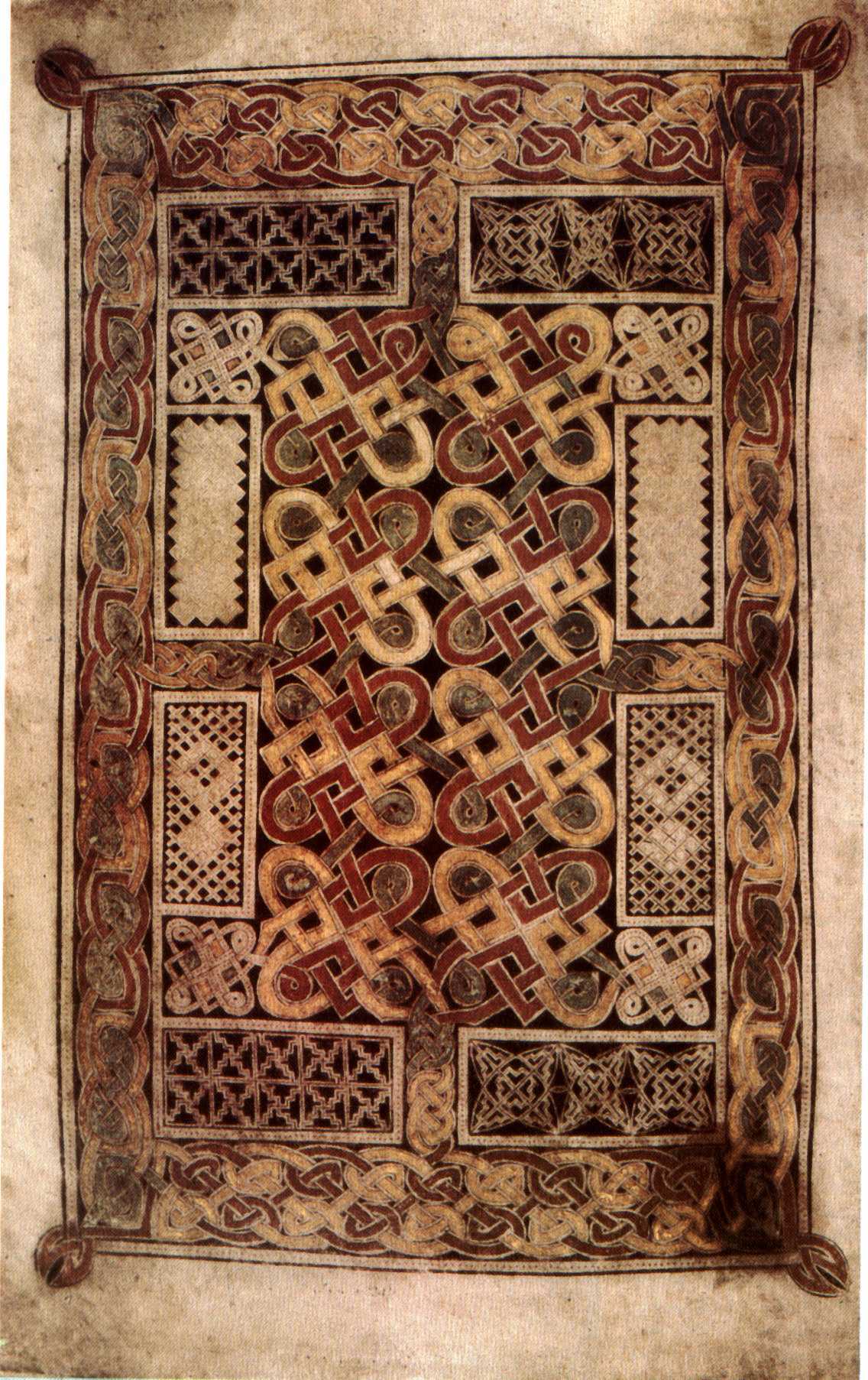
In Durrow, you immediately sense the constraint. The broad geometric bands remain compartmentalized, the central ornament stays contained, and the whole page acts as a sturdy container for sacred geometry. By understanding Durrow’s strict boundaries, the departures taken at Lindisfarne, and later by the Kells workshop, become sharply visible.
The Lindisfarne Logic: Absolute Discipline
To look at the Lindisfarne Gospels – Carpet Page (circa 715 CE) is to watch order hold under pressure. Produced on the tidal island of Lindisfarne off the Northumbrian coast, the manuscript is traditionally associated with Eadfrith and made in honor of St. Cuthbert.
The steadiness of the system is the first thing to notice. Compass work, ruled planning, and exceptionally consistent interlace keep the page taut from edge to edge. When you trace an animal’s elongated neck through a Lindisfarne knot, the over-under sequence almost never falters. The symmetry is rigorous, but the page still breathes. It is complex without becoming opaque, which is why the cross can remain legible against the background field.
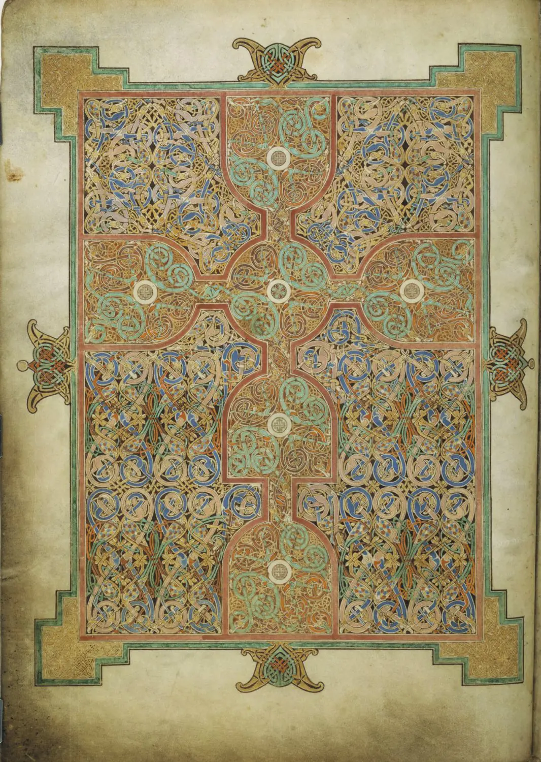
How to spot a Lindisfarne page: Look for the grid. Does the page feel balanced? Is the color palette highly controlled, relying on deliberate alternations of red, blue, and yellow to clarify the braided paths? Does the interlace respect the overall shape of the cross or the letter it inhabits? If the answer is yes, you are looking at the disciplined brilliance of Lindisfarne.
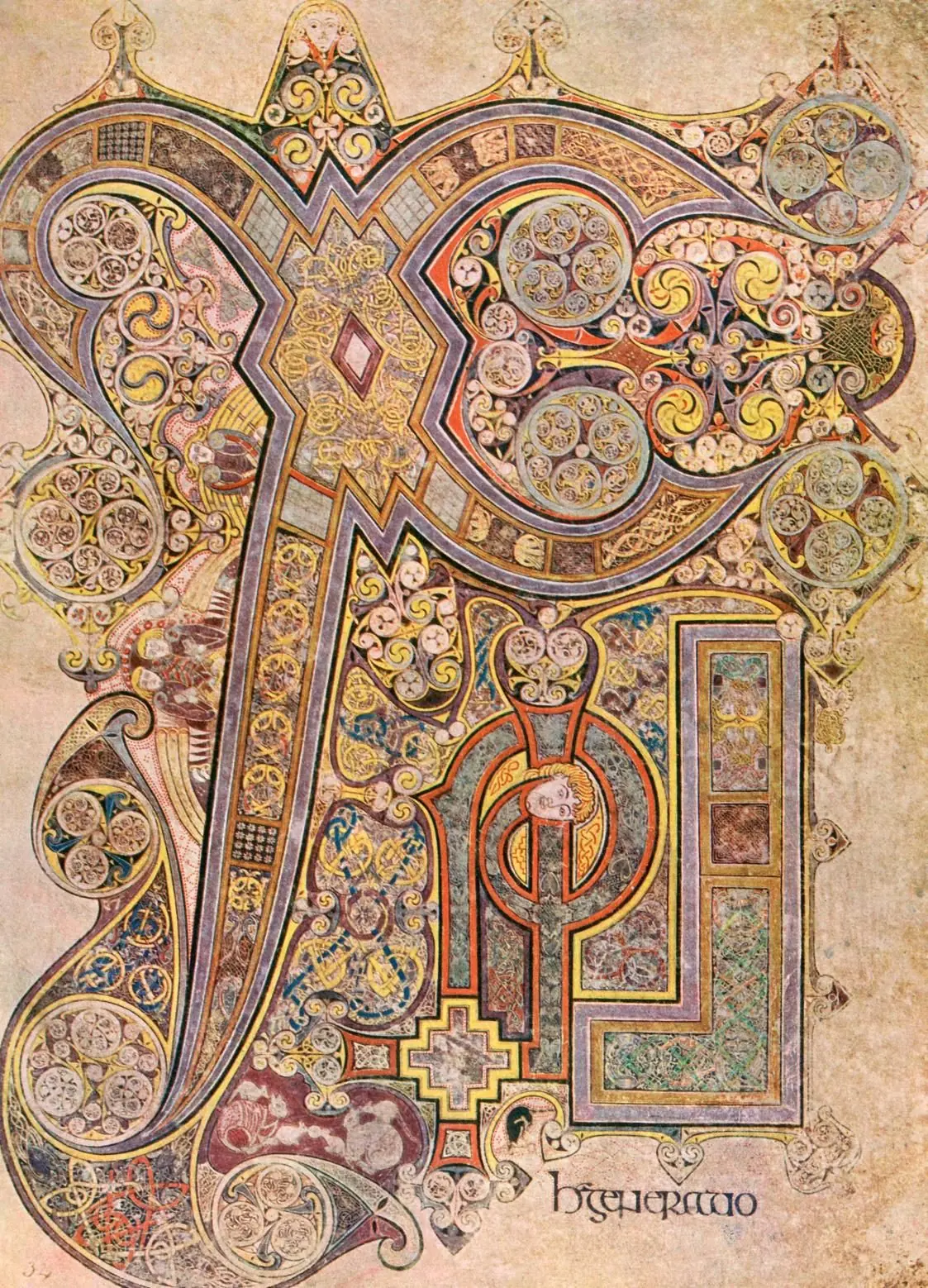
The Kells Logic: Hypnotic Density
Fast forward roughly eighty years to the creation of the Book of Kells (circa 800 CE). The context has changed dramatically. Viking raids are destabilizing the monastic networks of the British Isles. The manuscript is a massive, incredibly expensive collaborative project, likely started in Iona and moved to Kells in Ireland for safety.
If Lindisfarne feels like a system held under tight control, Kells feels like the same system pushed to a different pitch by a larger workshop. Take the famous Book of Kells Chi Rho Page. The central monogram (XPI, for Christi) does not merely sit on the page; it expands through it. Where Lindisfarne leaves breathing room to clarify structure, the Kells artists move closer to horror vacui, filling the field with micro-interlace, spirals, and hidden figures. The over-under sequencing that remains almost perfectly stable at Lindisfarne becomes harder to sustain under the weight of so much overlapping detail.
Furthermore, Kells is highly narrative and playful in a way Lindisfarne is not. Look closely at the Chi Rho page, and you will find mice fighting over a communion wafer while cats watch, or otters catching fish. The letters themselves transform into bodies. The geometry is no longer a static container; it is alive, writhing, and constantly shifting scale.
How to spot a Kells page: Is there empty space, or is the parchment completely overwhelmed by pigment? Are there sudden, surreal intrusions of humans and animals morphing into letterforms? Does the scale shift abruptly from massive, bold spirals to microscopic knotwork requiring a magnifying glass to decode? That is the signature of the Kells workshop.
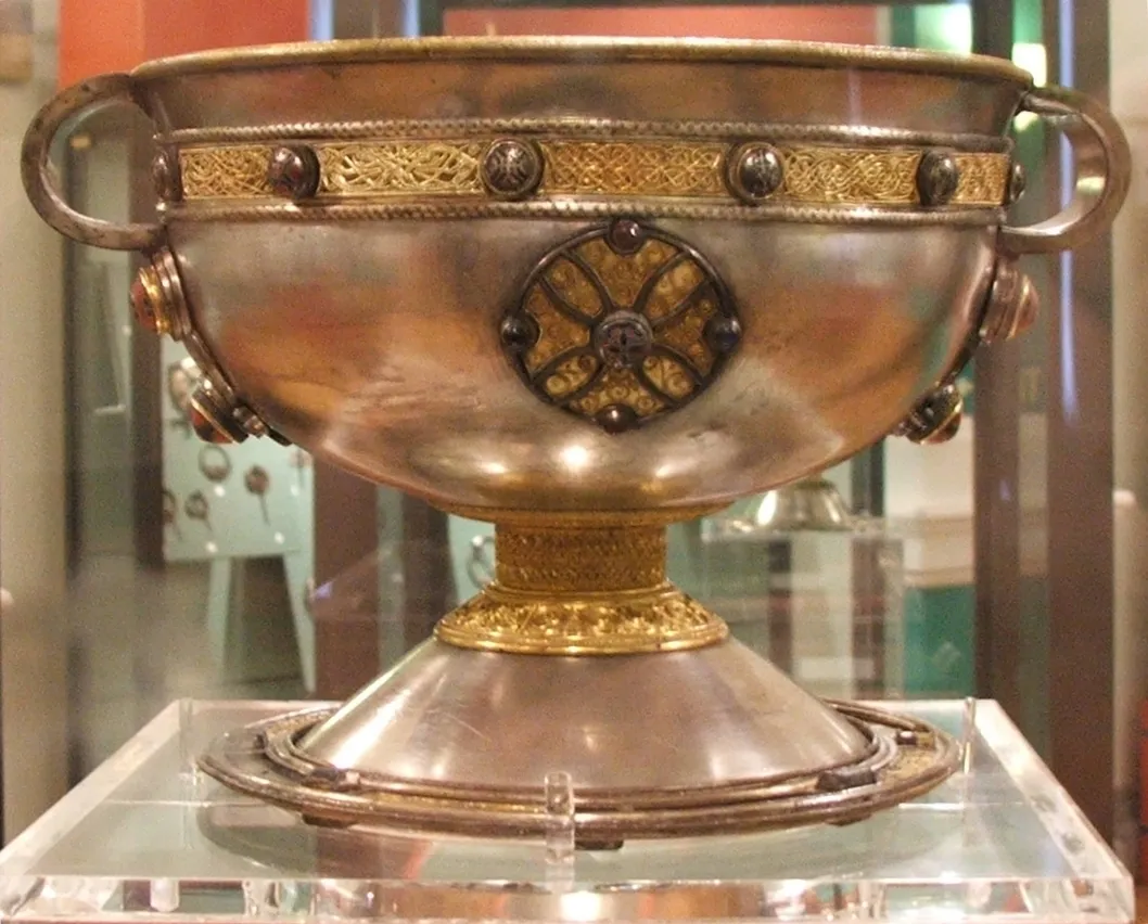
Reading Across Mediums: The Metalwork Connection
These manuscripts make more sense once you remember that the same visual habits shaped other high-status objects of the period. The grammar of tension, interlace, and color blocking seen on vellum also appears in gold, silver, and enamel. Insular art was never only a book style.
Consider the Ardagh Chalice, a masterpiece of eighth-century Irish metalwork. The gold filigree bands running around the bowl of the chalice employ the precise animal interlacing and geometric knotwork seen in the manuscripts. The colored glass studs mimic the heavy, flat application of manuscript pigments. The artists working on the Book of Kells were essentially replicating enameled metalwork on a flat, organic surface. Recognizing this cross-media conversation is what elevates an analysis of Insular art from basic observation to structural understanding.
Different Systems of Visual Order
It is deeply instructive to step entirely outside the Insular movement to understand what these monks were *not* doing. If you look at the Carolingian Art movement—happening on the continent around the same time as Kells—you see a completely different visual ambition. Carolingian scribes under Charlemagne were attempting to revive Roman realism. They painted figures that stood on solid ground, wearing togas that showed volume and shading.
Similarly, if you move forward to the 11th century and examine the Bayeux Tapestry, the visual logic is purely narrative. The Tapestry is a sequence of events designed to be read linearly, like a comic strip, to tell the story of a conquest. The figures are active and directional.
The Insular manuscripts reject both Romanizing realism and linear narrative. The monks of Lindisfarne and Kells were not trying to open a window onto physical space, nor to tell a sequential earthly story. They were building pages that suspend ordinary reading and convert it into contemplative attention before the Word of God is encountered.
The Legacy of the Interlace
The structural density perfected in Kells and the rigorous control mastered in Lindisfarne largely vanished as Europe moved toward the Romanesque and Gothic eras, where legibility and vast architectural narratives took precedence over private contemplation. However, the sheer graphic power of the Insular knot never entirely disappeared from the visual lexicon.
When the nineteenth-century Arts and Crafts movement looked for an alternative to industrial standardization, designers like William Morris looked backward. In works like the Strawberry Thief pattern, Morris revived the medieval principle of dense, organically continuous surface decoration — a secular descendant of the formal logic developed in the scriptoria of Lindisfarne and Iona.
The Final Test
Both the Book of Kells and the Lindisfarne Gospels are extraordinary, but they ask different things of the viewer. Lindisfarne teaches you to admire control, proportion, and clarity under pressure. Kells asks you to accept a denser, more elastic field in which meaning accumulates through excess, surprise, and sustained looking.
The next time someone shows you a "Celtic manuscript page," run the mental checklist. Do you see strict geometry and readable, spacious interlace? You are likely looking at the controlled discipline of Lindisfarne. Do you see shifting scale, microscopic detail, and cats hunting mice inside the letter 'T'? You have stepped into the labyrinth of Kells.
Want to put this knowledge to the test right now? Head over to our artwork quiz and see if you can reliably separate the disciplined order of the seventh century from the hypnotic density of the ninth.
Primary Sources
- British Library — The Lindisfarne Gospels
- Trinity College Dublin — The Book of Kells
- National Museum of Ireland — The Ardagh Chalice
- The Metropolitan Museum of Art — Insular Art
- Trinity College Dublin — Book of Kells Digital Collection
- Grove Art Online — Insular Art Entry
- JSTOR — Insular Manuscript Studies
- Encyclopaedia Britannica — Book of Kells
Related Explorations
Frequently Asked Questions
The Lindisfarne Gospels are older. They were created around 715 CE, while the Book of Kells was produced almost a century later, around 800 CE.
Yes. Both are pinnacle achievements of Insular art, a movement that fused Celtic, Germanic, and Roman visual traditions in the monastic centers of Ireland and Britain.
The Lindisfarne Gospels are housed in the British Library in London. The Book of Kells resides in the library of Trinity College Dublin.