
Insular art
Book of Kells Chi Rho Page: Meaning and Symbols (Folio 34r)
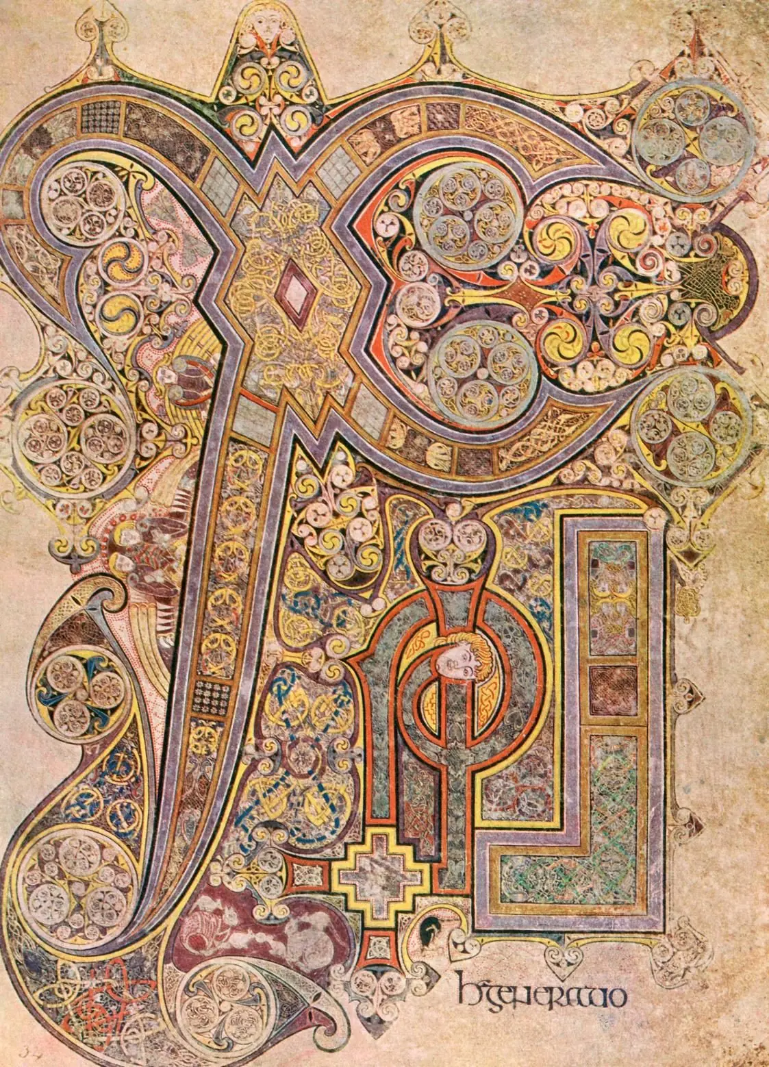
The Book of Kells Chi Rho page is the manuscript's most famous folio because it turns the name of Christ into an image. Usually seen through the detail from folio 34r, it expands the Christ monogram into a field of script, ornament, symbol, and devotional intensity instead of treating it as plain lettering.
What the page does
The Chi Rho page turns the first two Greek letters of Christ into a full-page act of attention. The large X and P anchor the design, while interlace, color, tiny figures, and abrupt scale shifts slow the reader at Matthew 1:18. Most online reproductions show a detail from folio 34r, not the whole manuscript page.
What this artwork actually is
The Book of Kells Chi Rho page is not an isolated painting. It is a manuscript page from the Book of Kells, an illuminated Gospel book made around 800 in the world of Insular art. The image most people know is a detail from folio 34r, not the whole page. In the manuscript, the folio introduces the phrase Christi autem generatio in Matthew 1:18.
The Chi-Rho page was made for a book, for liturgy, and for concentrated looking. Someone encountering it in the manuscript would meet it as a threshold into sacred text, not as a framed picture on a wall.
Historical context
The Book of Kells belongs to a monastic culture linked to Iona and Kells, in which script, ornament, theology, and display are tightly bound together. Gospel books like this were expensive, prestigious objects. They helped honor scripture, teach doctrine, and project institutional authority at the same time.
Around 800, a manuscript could be a liturgical tool, a teaching object, and a sign of sacred prestige at the same time. Folio 34r condenses those functions into a single surface.
What to notice first
Start with the biggest shapes, not the tiniest details. The giant X and P of the Christ monogram anchor the page. Only once those larger forms are clear should the eye move outward into the interlace, spirals, color accents, and small figures embedded in the surface.
- Find the large letter-forms first.
- Notice how huge shapes and tiny details share the same page.
- Watch how the eye is pulled inward and then deliberately delayed.
- Ask where writing ends and image begins; on this folio, the answer is never simple.
What the page was meant to do
The makers were not decorating text after the fact. They were turning a sacred name into an act of attention. The page slows reading down, converts the opening of Matthew into an event, and makes devotion happen through looking. Ornament is therefore not secondary here. It is the means by which meaning arrives.
This also helps explain the page's underlying method. The structure had to be ruled, planned, and coordinated before the surface could open into so many tiny forms. If you want the production side of that world, the next useful stop is Insular Monastic Workshops.
Details worth slowing down for
The page rewards both first-time viewers and advanced readers because it works at several scales. From a distance, it looks monumental. Up close, it becomes a world of minute decisions: interlace routes, color punctuation, tiny creatures, and abrupt shifts in scale. Not every micro-detail has a single fixed interpretation, and that is part of the effect. The viewer is asked to move constantly between recognition and scrutiny.
That tension is one reason folio 34r became iconic. It is immediately memorable, yet it does not flatten under closer study. It still preserves evidence of pigment preparation, ruled planning, and coordinated execution between scribes and illuminators.
Where it sits in the Insular sequence
Kells reads most clearly as a culmination. Begin with the Book of Durrow, where the grammar is still clearly compartmentalized, then move to the Lindisfarne carpet page, where the same grammar becomes more exact and more unified. Kells then appears as an expansion rather than as generic medieval complexity.
Seen after those two pages, folio 34r stops looking like pure exuberance. It becomes easier to see what Kells is actually doing: taking the same Insular habits of framing, repetition, and symbolic emphasis, then pushing them toward greater density, looser scale shifts, and a more theatrical surface.
The essay Book of Kells vs Lindisfarne Gospels extends that reading path: what to look at first, how Kells differs from Lindisfarne, and why Durrow remains the earlier baseline. After that, compare Kells with the more Romanizing legibility of Carolingian art or use the art quiz as a quick check.
Explore more
Related works
Primary sources
Frequently asked questions
Chi and Rho are Greek letters used as a Christ monogram. On folio 34r, that monogram expands into a full devotional image.
Most reproductions show a detail from folio 34r rather than the entire manuscript page. In the book, the folio introduces the phrase Christi autem generatio in Matthew 1:18.
It was designed to slow reading and turn the opening of Matthew into an act of devotion. Script, ornament, and scale work together so that the sacred name becomes an image.
Start with the giant X and P of the Christ monogram. Then move outward into the interlace, color accents, and tiny figures that make the page work at several scales at once.