
Movement Guide
Insular Art: Definition, Manuscripts, and Key Objects
Insular art is easiest to recognize when a manuscript page refuses to behave like ordinary writing. Letters swell, borders knot, crosses become fields of pattern, and the eye has to slow down before it can read. Between the seventh and ninth centuries, monasteries around the Irish Sea turned Gospel books and liturgical objects into ritual surfaces built from interlace, initials, color, frames, and disciplined ornament.
Once you understand what these pages are trying to do, the famous works stop looking like beautiful puzzles and start reading as parts of one coherent system: Durrow sets out the grammar, Lindisfarne tightens it, Kells pushes it toward maximum density, and the Ardagh Chalice carries the same discipline into metalwork.
Insular art in one sentence
Insular art is the early medieval art of Ireland, Britain, Iona, Lindisfarne, and related monastic networks, best known for Gospel books and liturgical metalwork. Its pages use interlace, framed ornament, initials, color, and controlled pattern to make reading devotional and slow. Kells is not an isolated marvel; it sits in a sequence with Durrow, Lindisfarne, and Ardagh.
An Irish Sea world, not a remote fringe
In current geography, this world stretches from Ireland to Iona off western Scotland, then across to Lindisfarne on the coast of present-day Northumberland and down into Northumbrian church networks. Kells sits in County Meath, northwest of Dublin. The map matters because Insular art is not born in an isolated mist. It belongs to a connected maritime zone where sea travel often links monasteries more effectively than inland roads do.
The movement forms there because monasteries in the far west of the former Roman world become powerful centers of learning, copying, liturgy, and visual production. Missionary travel, relic cults, and elite patronage push books and portable objects to unusually high levels of finish. What survives is not a single local style, but a shared visual culture moving between houses.
What an Insular page is trying to do
An Insular manuscript page is not a window onto physical space and not a narrative scene in the later Bayeux Tapestry sense. It is a surface that prepares the reader for sacred text. Carpet pages pause the reading. Great initials turn letters into events. Ornament slows the eye down long enough for scripture, memory, and hierarchy to enter together.
These pages reward a different kind of looking from Renaissance or Carolingian images. You do not ask first where the bodies stand or how the space recedes. You ask how the frame holds, how the border guides, how the line turns back on itself, and how long the page can keep your attention before it feels unstable.
- Start from the border or the major letter before chasing small detail.
- Watch how script turns into image without fully separating from it.
- Track changes of scale between large forms and tiny interlace.
- Treat repetition as a method of memory and devotion, not spare decoration.
Durrow, Lindisfarne, Kells: how the language changes
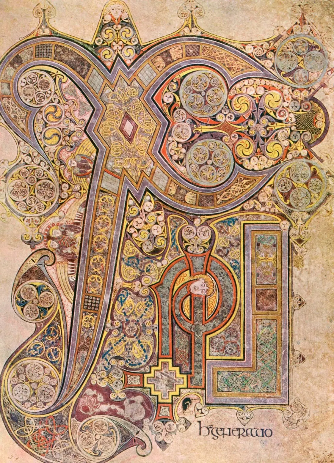
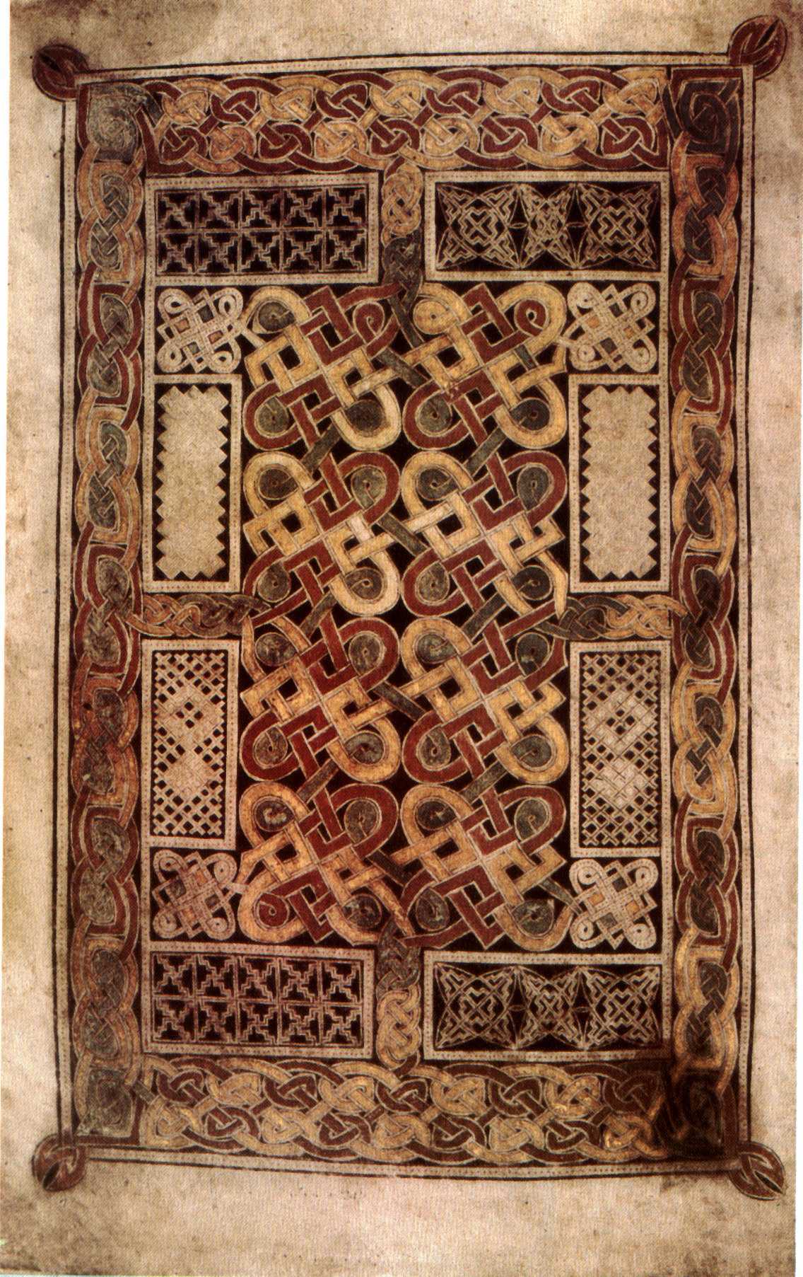
The easiest way into the movement is chronological because the major works really do build on one another. The Book of Durrow keeps the grammar open enough for you to see it: strong framing, clear compartments, repeated motifs, and a surface that stays calm under close looking.
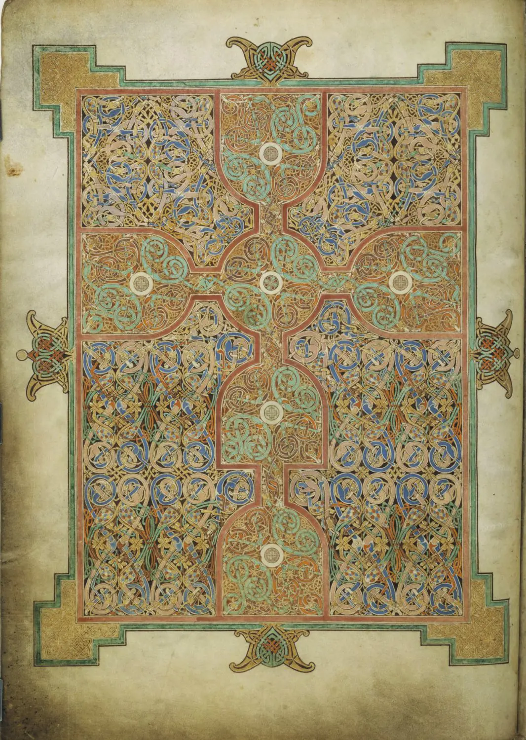
The Lindisfarne carpet page, traditionally linked to Eadfrith, keeps the same vocabulary but subjects it to much tighter control. The grid is firmer, the cross reads more clearly at a distance, and the interlace holds together under heavier pressure.
The Book of Kells then pushes the same language toward a denser and more elastic surface. The monogram expands, the scale shifts become more abrupt, and the eye spends longer working through the page. Read beside Durrow and Lindisfarne, Kells stops looking like generic medieval complexity and becomes a late, deliberate expansion of the same system. The essay Book of Kells vs Lindisfarne makes that distinction especially clear.
From vellum to metal: the same intelligence in another medium
Insular art is easier to misread if you keep it inside manuscripts. The same habits of framing, rhythmic density, and symbolic emphasis move into liturgical metalwork. The Ardagh Chalice proves that directly. Its calm silver body, dense filigree bands, and engraved inscriptions distribute attention almost like a page does.
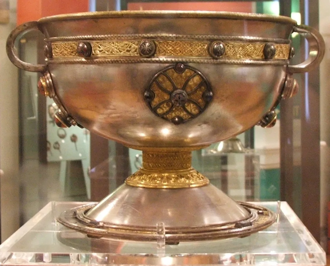
That cross-media continuity is one of the movement's strongest lessons. Books, chalices, and other precious objects belong to the same culture of making. They are all designed to hold memory, authority, and devotion in a highly controlled visual form.
What makes it distinct from nearby medieval art
Compared with Carolingian art, Insular art is less interested in modeled bodies, revived Roman space, or easy narrative legibility. Compared with later Romanesque art, it is less about broad architectural storytelling and more about concentrated page experience. Its power comes from line, compartment, repetition, and the pressure it puts on the eye.
The movement still feels distinct today. These works do not ask the viewer to enter a scene. They ask the viewer to stay on the surface long enough for the surface itself to become meaningful.
Key artists
Key works in Explainary
Related movements
A productive route through the subject is simple: read Durrow, then Lindisfarne, then Kells, then the Ardagh Chalice, then the workshops page. The art quiz is a good final check once those forms start separating clearly in your mind.
Primary sources
- The Metropolitan Museum of Art — Insular Art
- British Library — Lindisfarne Gospels
- Trinity College Dublin — Book of Kells
- National Museum of Ireland — The Ardagh Chalice
- Durham World Heritage Site — Lindisfarne History
- Encyclopaedia Britannica — Hiberno-Saxon style
- The British Museum — Insular art research entries
- The Getty — Insular art research entries