
Insular art
Lindisfarne Gospels Carpet Page
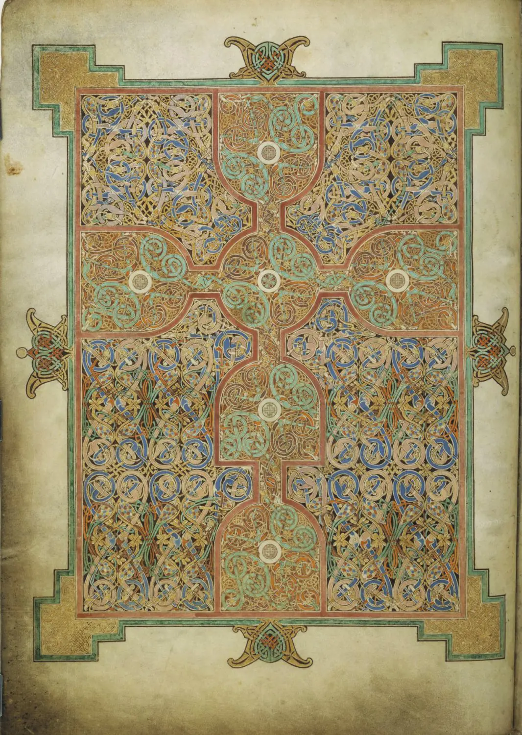
At first glance the page is a maze of knots; step back and a cross snaps into place. That double reading is the point. The Lindisfarne carpet page uses interlace, color, frame, and symmetry to slow the eye before the Gospel text begins.
A beginner should not start with every tiny band. Start with the cross, then the border, then the way the knots keep sending the eye back inward. The page is devotional because it turns looking into a controlled pause, not because it illustrates a story.
The carpet-page test
A carpet page is a full manuscript page where ornament becomes a devotional threshold. In Lindisfarne, the cross supplies the long-distance structure, while interlace, knotwork, and color slow the eye before reading resumes. Read it between Durrow and Kells: Lindisfarne is the tighter, more geometric middle point.
What a carpet page is
A carpet page is a full-page design with no narrative scene and usually no readable text. Instead of telling a story, it prepares the reader to enter sacred writing. In the Lindisfarne Gospels, that preparation happens through pattern: the eye pauses, follows lines, returns to the center, and only then moves on.
This folio is one of the fastest ways to understand early Insular art because its logic stays readable under pressure: a cross-centered layout, a strong frame, and a surface held together by repeated knotwork.
Where it comes from
The Lindisfarne Gospels were made in Northumbria in the early eighth century, in a monastic culture shaped by exchanges between Lindisfarne, Iona, and Ireland. A later colophon links the manuscript to Eadfrith, bishop of Lindisfarne, which is why the book is often discussed through his name even though a workshop almost certainly stood behind it.
This historical setting matters because the page is not an isolated ornament. It belongs to a world where books were liturgical objects, teaching tools, and prestige objects at once. The carpet page therefore sits between devotion and design: it serves prayer, but it also displays extraordinary control of the page as a visual surface.
The makers' intention
The intention was not to illustrate a biblical episode. It was to create a page that disciplines attention before reading begins. The design is so controlled because the cross anchors the eye, the interlace slows it down, and the repeated pattern turns looking into a deliberate act rather than a quick glance.
How the page guides the eye
From a distance, the cross gives the page its structure. Up close, that clarity breaks into dozens of small decisions: interlaced bands, tiny turns, repeated modules, and careful shifts in color. The page works because both scales stay active at once. You never lose the whole, but the whole is made from patient local complexity.
Its artistic force comes from that tension between rule and invention. The page is rigorously geometric, yet it never feels mechanical. Flat bands of red, yellow, green, and dark outline keep the surface bright and severe at the same time, while the hand-drawn irregularities stop the pattern from becoming dead repetition. It has something of the logic of textile and jewelry design, but translated into a page that still feels ceremonial rather than decorative.
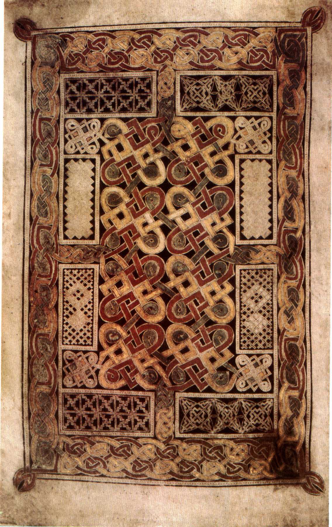
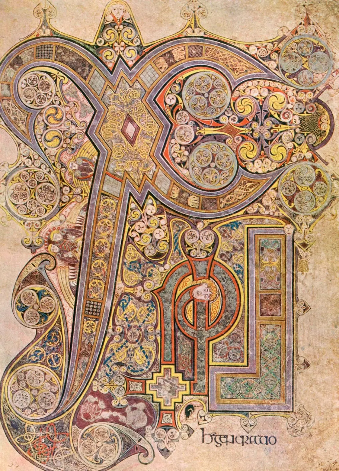
That balance is what makes Lindisfarne so impressive. It is less compartmentalized than the Book of Durrow carpet page, but it is also less explosive than the Book of Kells Chi-Rho page. It holds the middle point of the Insular sequence: stricter than Kells, richer than Durrow, and unusually clear in its geometric discipline.
How to place it in the Insular sequence
Start with Durrow. Its framing system is more compartmentalized, which makes the underlying grammar of Insular manuscript design easy to name: border, panel, repetition, and pause. Lindisfarne keeps that grammar but tightens it into a more unified visual field.
Then move to Kells. There the same Insular vocabulary becomes much denser and more theatrical, especially when letters themselves take over the page. Seen in that sequence, Lindisfarne is the work that shows how the system became both more exact and more ambitious before Kells pushed it toward spectacle.
The page makes a few fundamentals visible very quickly: ornament can structure attention, monastic craft depends on planning, and abstraction can stay exact without turning empty. From here, the Eadfrith page, the Insular monastic workshops, and the essay Book of Kells vs Lindisfarne Gospels all become easier to read.
The Ardagh Chalice is the last comparison to make, because similar ornamental intelligence moves there from vellum to metal. Then try the art quiz and see whether Insular pages now stand out more clearly.
Explore more
Related works
Primary sources
- British Library - Digitised manuscripts and archives
- Encyclopaedia Britannica - Lindisfarne Gospels
- Smarthistory - The Lindisfarne Gospels
- University of Michigan - Carpet page preceding the Gospel of Saint John
- British Library - Digitised manuscripts portal
- Wikimedia Commons - folio image
Frequently asked questions
A carpet page is a full-page field of ornament placed before sacred text. In manuscripts such as the Lindisfarne Gospels, it acts as a visual pause that prepares the reader for the Gospel that follows.
The manuscript is traditionally linked to Eadfrith, bishop of Lindisfarne, because a later colophon credits him with writing it. Scholars still discuss how much was done by one person and how much belonged to workshop collaboration.
Lindisfarne is usually more measured and geometric. The Book of Kells keeps the same Insular vocabulary but pushes it toward denser, more theatrical surfaces.