
Abstract Art
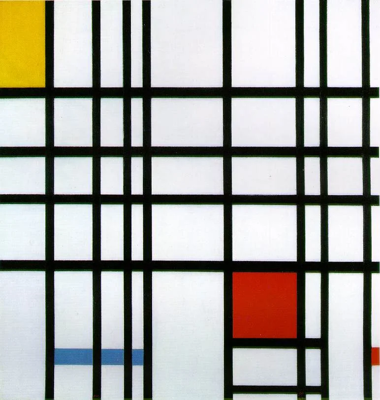
Composition with Red, Blue and Yellow
A rigorous but lively grid where proportion, pause, and color placement create dynamic equilibrium.
Order that never becomes static
Mondrian’s painting can look rigid until you track its asymmetries. Lines do not distribute weight evenly; color blocks are sparse but strategic. The composition holds because imbalance is carefully tuned, not eliminated.
That tuning is why this work remains influential in architecture, product design, and interface layout: it shows how constraint can produce expressive range.
From landscape to grid
Mondrian did not begin with pure geometry. He moved through trees, facades, and faceted forms before arriving at horizontal/vertical structure. Seen historically, the grid is not a default—it is an achieved abstraction.
In this 1930 painting, the vocabulary is minimal: black lines, primary colors, white ground. Yet perceptual complexity is high because spacing, adjacency, and interruption do the narrative work.
De Stijl in practice
De Stijl proposes universality through reduction: fewer variables, clearer relations, broader legibility. Mondrian applies that ideal without flattening sensation. The painting still pulses through line thickness and chromatic pressure.
When modern visual systems rely on modular grids, this canvas remains a rigorous reminder that structure is never neutral; it carries rhythm, hierarchy, and ideology.
Abstraction here is not the absence of meaning; it is meaning organized through relation, rhythm, and attention.
Beyond the myth of neutrality
Mondrian's grid is often presented as neutral, universal, and almost mathematical. That reading is only half true. The painting uses strict constraints, but it is full of decisions that cannot be derived from a formula: where a line stops, where a block is left white, how much red can dominate before the whole surface tips. Universality here is negotiated, not automatic.
This matters because De Stijl was not only a style project; it was a social project. Mondrian and his peers believed that clear relations in form could support a clearer modern life. Whether or not one shares that optimism, this painting shows the ambition in concrete terms: reduce noise, intensify structure, and make each relation legible.
Mondrian's intention is to make visual order legible without decorative excess. His method is precise: limit vocabulary, calibrate intervals, and let each line ending or color block shift the balance of the whole field.
Line endings and active white fields
Mondrian's black lines are structural beams, not outlines. Their interruptions are decisive: where a line stops, tension starts; where a block hits the frame, weight shifts. Just as important, white is not passive background. It is the breathing field that lets chromatic pressure circulate without collapse.
This is why the grid stays alive under prolonged viewing. The painting looks static from a distance, but close inspection reveals calibrated instability through interval, asymmetry, and saturation control.
Design legacy, used well or badly
The painting's afterlife in design is huge, but often superficial. Branded "Mondrian style" layouts sometimes copy color blocks without understanding structural discipline. The deeper lesson is not visual quoting; it is relational thinking. Every element gains meaning from its neighbors and from what is withheld.
This remains a high-value lesson for interfaces, editorial systems, and data layouts. Clarity comes from hierarchy and interval management, not from decorative minimalism. Seen with De Stijl, Mondrian's profile, and works by Kandinsky or Malevich, the canvas becomes a rigorous manual for designing attention.
By comparison, Yellow-Red-Blue tests a looser balance, while Simultaneous Contrasts: Sun and Moon pushes color relationships toward rotational tension. For historical context, read when artists started abstract art.
Explore more
Related works
Use the art quiz as a quick check: can you connect Composition with Red, Blue and Yellow to Piet Mondrian when the options are mixed?