
Movement Guide
Orphism
Orphism matters because it proves that abstraction does not have to choose between rigor and delight. Around 1912, Robert and Sonia Delaunay began treating color as a structural force capable of generating movement, tempo, and spatial pressure on its own. What first looks like radiant decoration is actually one of the clearest attempts to make painting behave like music: not by illustrating a concert, but by organizing intervals, returns, and intensities directly on the surface.
That is why Orphism deserves more attention than it usually receives in survey histories. The label was short-lived and the movement was never large, yet it solves a decisive modern problem. It shows how a painting can remain sensuous and luminous while becoming fully analytical about perception, rhythm, and modern visual life.
Apollinaire names more than "colorful Cubism"
The term comes from Guillaume Apollinaire, who wanted a name for painting that had moved beyond Cubist fracture without returning to descriptive illusion. The easy mistake is to hear Orphism as a poetic nickname for bright canvases. That undersells the ambition. The real wager is that color, once freed from descriptive duty, can build a composition the way harmony builds a piece of music.
Seen historically, Orphism grows out of several pressures at once: Cubist fragmentation, post-impressionist attention to color relations, and new thinking about simultaneity in modern city life. Chevreul's writing on simultaneous contrast matters here, but Orphism is not a diagram of color science. It turns chromatic theory into pictorial tempo. That is why it sits productively between Neo-Impressionism, which calibrates color scientifically, and Abstract Art, which pushes relation itself toward the status of subject.
Robert and Sonia Delaunay turn simultaneity into a method
Robert Delaunay is the movement's clearest anchor on Explainary, but Orphism makes less sense if Sonia Delaunay is reduced to a footnote. In prewar Paris, windows, electric light, textiles, posters, and rapid urban circulation all helped make perception feel discontinuous and accelerated. The Delaunays answer that condition by treating juxtaposed color as an engine of sensation.
This is also why Orphism belongs in any serious history of modern design. Sonia Delaunay carries chromatic simultaneity into textiles, fashion, books, and interiors, proving that the movement was never only about easel painting. Read beside the essay on synesthesia and abstract art, Orphism looks less like an eccentric side branch and more like a central experiment in how modern vision could be organized.
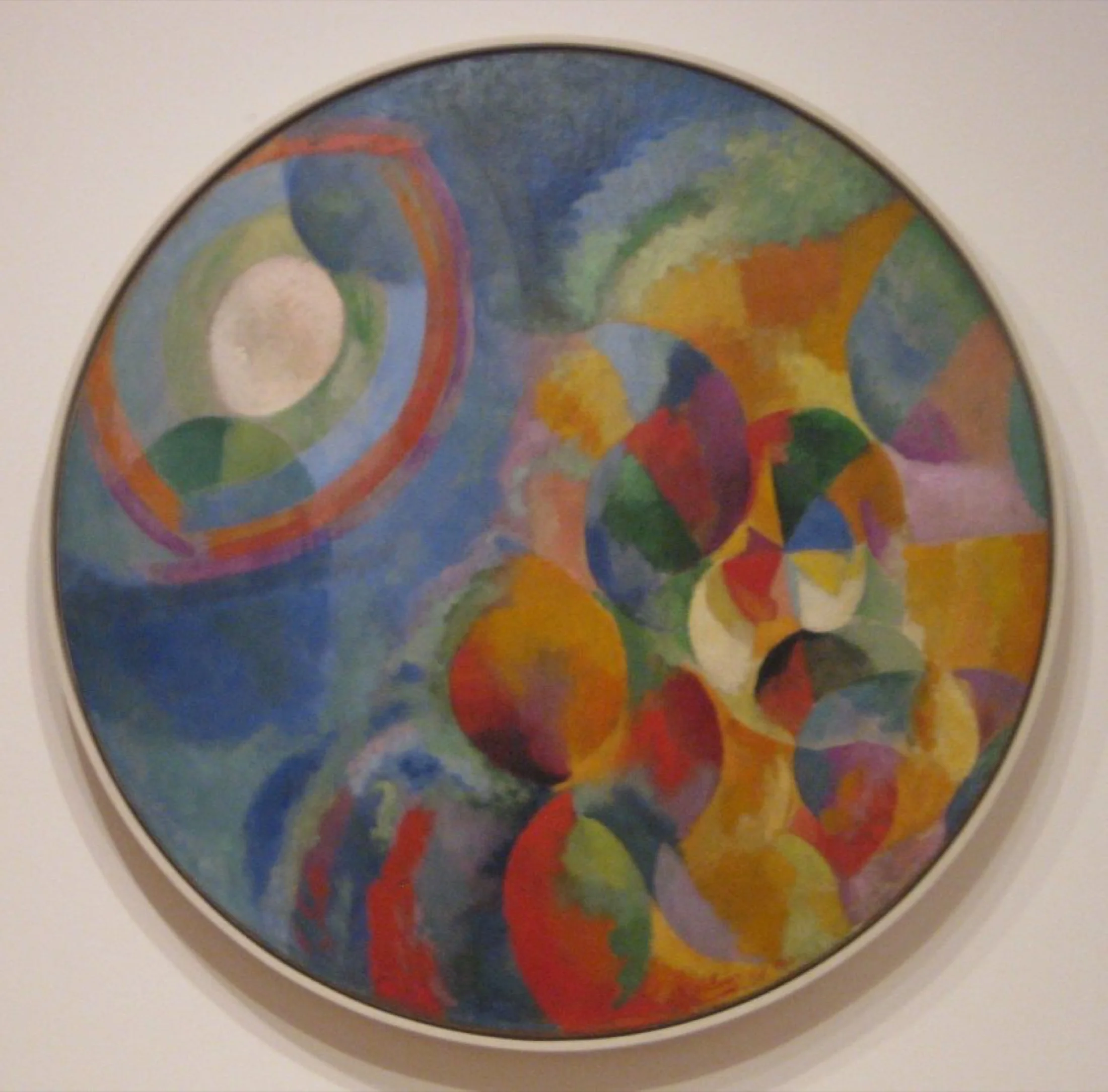
Sun and Moon shows Orphism at full intensity
A strong entry point is Simultaneous Contrasts: Sun and Moon. The title still gestures toward celestial reference, but the painting no longer wants to describe a scene in the ordinary sense. Discs, arcs, wedges, and chromatic intervals keep the eye rotating across the surface. The subject is less sun or moon than the experience of optical pressure itself.
That is where the movement's intelligence becomes visible. Color is not spread over a preexisting drawing. It constructs the event. Warm and cool zones push and pull, circular returns prevent the eye from settling, and difference becomes tempo. If early abstraction sometimes feels remote to first-time viewers, Orphism usually feels immediate, because it builds sensation without surrendering structure.
Why Orphism matters even though the label is brief
The word itself peaks before the First World War, and that brevity partly explains why Orphism is often marginalized. But short duration is not the same as minor importance. The movement gives abstraction one of its clearest lessons: vivid color can be analytical. It can organize depth, sequence, and attention rather than merely heighten mood.
That lesson travels far. Compare Orphism with De Stijl or Suprematism and you see different answers to the same modern question: what remains when painting stops depending on descriptive subject matter? De Stijl seeks stricter order, Suprematism pursues radical reduction, and Orphism keeps luminous circulation alive.
How to place Orphism among neighboring abstractions
- With Neo-Impressionism, it shares close attention to color relations, but not the same pictorial logic. Seurat stabilizes; Orphism pulses.
- With Composition VII, it shares musical ambition, but Kandinsky tends toward orchestral turbulence while Orphism is more legible through interval, cycle, and return.
- With De Stijl, it shares abstraction's move away from description, but Mondrian strips harder toward rule. Orphism keeps chromatic vibration in play.
Key artists in Explainary
Key works in Explainary
A strong route through the movement is simple: begin with Simultaneous Contrasts: Sun and Moon, then compare it with Composition VII, then finish with Composition with Red, Blue and Yellow. The sequence makes Orphism easier to place: between musical abstraction and stricter visual system-building.
Use the art quiz as a quick check: can you recognize Orphism not just by bright color, but by the way color itself builds rhythm, interval, and movement?
Primary sources
Frequently asked questions
No. Orphism grows out of Cubist fragmentation, but it pushes much harder toward luminous color, optical simultaneity, and rhythmic circulation. Cubism often analyzes form; Orphism wants color itself to build movement and structure.
Sonia Delaunay shows that Orphism was never only an easel-painting label. Her work in textiles, fashion, books, and design proves that chromatic simultaneity could organize modern visual life beyond the gallery wall.