
Essential guide
How to Understand a Painting (Step-by-Step Guide)
Most paintings do not resist understanding; they resist rushed looking. People often assume that art becomes meaningful only after a curator, teacher, or textbook explains it. In practice, the first level of meaning is already visible. If you can slow down and separate a painting into a few stable layers, you can learn how to understand a painting, how to analyze a painting, and how to read art without turning the experience into jargon.
That is the goal of this page. It is not a museum etiquette note or a list of abstract terms. It is a reusable method that works on a calm portrait like Girl with a Pearl Earring, a crisis image like The Third of May 1808, or a non-narrative work like Composition VII. The structure changes from one painting to the next, but the questions stay surprisingly stable.
Why paintings feel harder than they are
Art feels difficult for three recurring reasons. First, viewers confuse information with looking: they start with the wall label, the date, or the reputation of the artist instead of the image itself. Second, they confuse subject with meaning: saying that a painting shows a woman, a battle, or a landscape is not yet an analysis of how the picture works. Third, they assume understanding art means memorizing symbols in advance. Usually it means noticing what the painting emphasizes, omits, and repeats.
This is why famous works can still feel strangely closed. Mona Lisa looks simple until you track how her pose, landscape, and sfumato build instability. The Garden of Earthly Delights looks overwhelmingly symbolic until you first sort the panels, clusters, and movement patterns. The Scream looks obvious until you ask why the bridge, sky, and figure feel fused into one pressure system. Difficulty often means that several layers are arriving at once.
The five layers every painting contains
A reliable reading starts by separating the image into five layers: composition, color, light, subject, and symbolism. You do not need to treat them as isolated boxes. The point is to stop everything from collapsing into one vague reaction.
| Layer | Core question | Good Explainary practice pages |
|---|---|---|
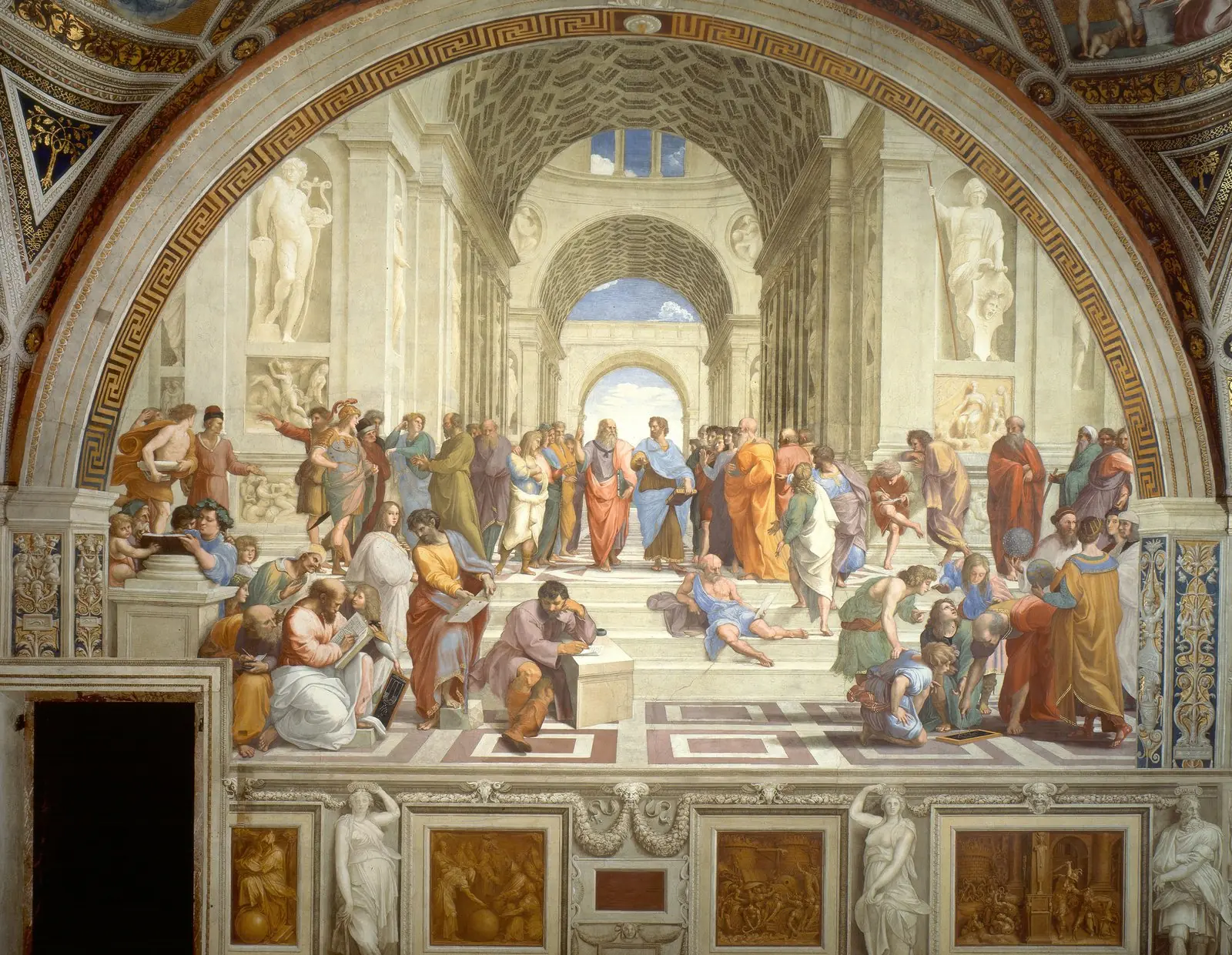
| Composition | Where does my eye go, and what holds the image together? | The School of Athens, Liberty Leading the People |
| Color | How does the palette set temperature, contrast, and mood? | The Starry Night, Red Fuji |
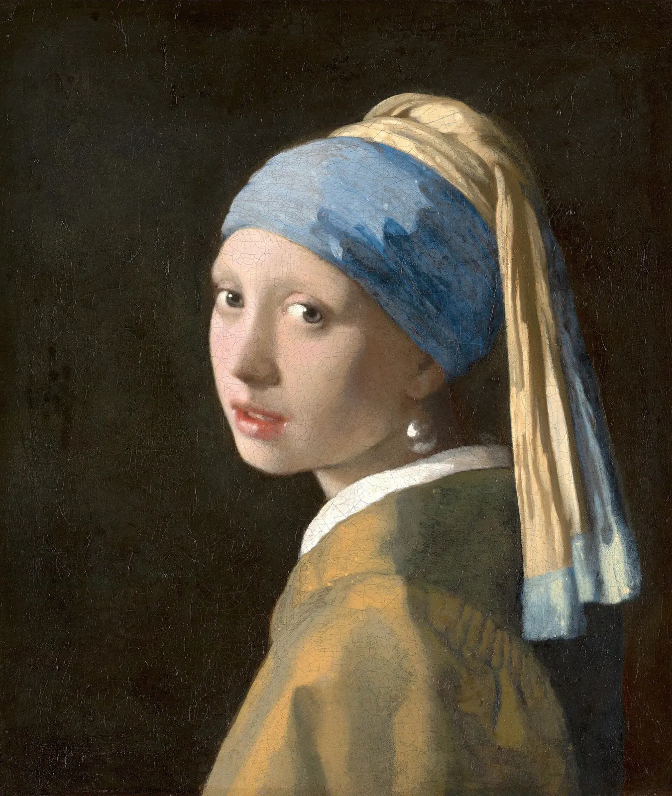
| Light | What is revealed, dramatized, or hidden? | The Calling of Saint Matthew, Girl with a Pearl Earring |
| Subject | What exactly is happening, and what kind of scene is this? | The Arnolfini Portrait, The Third of May 1808 |
| Symbolism | Which objects, gestures, or spatial choices carry extra meaning? | Las Meninas, Book of Kells Chi Rho Page |
Composition is the skeleton. Before you identify narrative, you can already see whether the image is stable, crowded, symmetrical, tilted, shallow, or expansive. Raphael builds order in The School of Athens through centered perspective and balanced groups. Delacroix drives agitation in Liberty Leading the People through diagonals, smoke, and upward surge.
Color is often the fastest emotional signal. Van Gogh's yellows against blue in The Starry Night create vibration before you name the village or cypress. Hokusai's restricted, emphatic palette in Red Fuji turns a landscape into a visual emblem by simplifying tonal decisions.
Light is less about realism than priority. Caravaggio's beam in The Calling of Saint Matthew does not merely illuminate a room; it assigns spiritual weight. Vermeer in Girl with a Pearl Earring uses a softer light to make attention feel intimate instead of theatrical.
If you want to isolate that logic before returning to the full method, read our guide to chiaroscuro and tenebrism. It shows how light builds volume, hierarchy, and pressure before symbolism enters the scene.
Subject is not the same as meaning, but you still need to name it precisely. Is the image a portrait, altarpiece, civic scene, history painting, devotional page, or domestic interior? The answer changes your expectations. The Arnolfini Portrait invites slow close reading because the scene is ceremonially staged. The Third of May 1808 demands an ethical and political reading because the action is public violence.
Symbolism is where many viewers panic and overreach. A better rule is simple: start with what feels deliberately placed. In Las Meninas, the mirror is not decorative background; it reorganizes who is looking at whom. In the Book of Kells Chi Rho Page, the ornamental density is not merely pretty surface; it behaves as devotional emphasis.
A five-step method you can actually use
Once the five layers are clear, the reading process becomes repeatable. This is the version you can use in a museum, a classroom, or while moving through Explainary's artwork library.
- Pause before the label. Give the painting twenty to thirty seconds of silent looking. Write one sentence about mood or pressure before you name anything.
- Trace the composition. Follow the path of your eye. Look for center, diagonals, clusters, empty zones, and scale shifts.
- Read color and light together. Ask what the palette does emotionally, then ask what the light selects, dramatizes, or withholds. If the surface handling is obvious, note that too.
- Name the subject precisely. Who is here, what are they doing, and which object or gesture feels staged rather than accidental?
- Add context last, then compare. Date, patron, function, movement, and a nearby comparison page on Explainary help stabilize the reading without replacing it.
That last step is crucial. Context should deepen observation, not substitute for it. If you learn that a work belongs to the Baroque, that should sharpen your attention to theatrical light and movement. If you learn that a work sits inside Impressionism, that should push you toward surface, atmosphere, and perception rather than symbolic decoding.
A painting becomes readable when you can move from reaction to evidence without losing the reaction.
Example analysis: reading Goya's The Third of May 1808
A real test matters more than abstract advice, so take The Third of May 1808. At first glance the image feels immediate: terror, exposure, inevitability. That is your first layer. But the painting becomes much clearer once you break down how Goya manufactures that feeling.
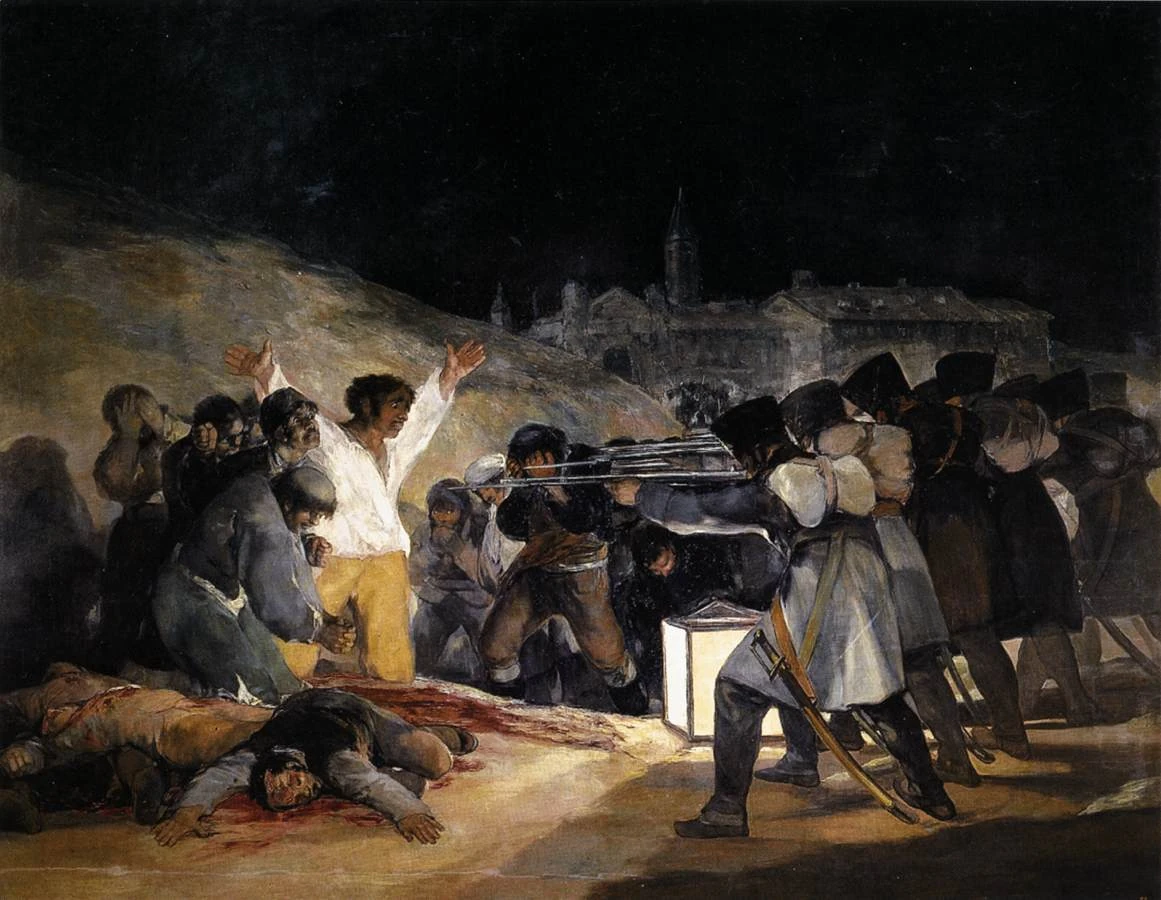
Composition first: the firing squad forms a blunt, almost mechanical block on the right, while the victims spread and collapse on the left. The picture is not balanced between two equal forces. It is staged as an encounter between machine-like repetition and human vulnerability. The hill behind compresses the space, so there is no visual escape route.
Color and light next: the lantern creates a hard pool of illumination that lands on the man in white and on the bodies already fallen. That white shirt functions almost like a visual alarm. The soldiers, by contrast, are darker and turned away from us, which helps Goya strip them of individuality.
Subject and symbolism then lock the image. The raised arms echo a crucifixion pose without turning the victim into a serene saint. He is terrified, not transcendent. That tension matters. Goya makes moral recognition happen through pose, light, and group structure before you know the historical story.
Only after that should context enter. The painting responds to Napoleon's occupation of Spain and belongs to a wider nineteenth-century shift in which history painting becomes less about exemplary heroes and more about political shock. Compare it with Liberty Leading the People: Delacroix turns uprising into collective forward motion, while Goya turns repression into frozen exposure. Same century, different emotional mechanics.
Common mistakes that make art seem arbitrary
Most weak interpretations do not fail because viewers lack intelligence. They fail because the sequence is wrong. People jump from vague feeling to big claim, or from label to conclusion, without building the middle layer of evidence.
| Common mistake | What it sounds like | Better move |
|---|---|---|
| Meaning before evidence | "This painting is about hope." | Point first to a color contrast, gesture, light source, or spatial choice that supports the claim. |
| Subject instead of structure | "It shows a dinner scene." | Ask how the scene is organized, paced, and prioritized, as in The Last Supper. |
| Reading the label too early | "The museum says it means X." | Look first, then use the label as a correction or confirmation rather than a script. |
| Symbolism everywhere | "Every object must stand for something." | Treat symbolism as a hypothesis until placement, repetition, or context makes the case stronger. |
Another frequent mistake is trying to sound profound too quickly. Precision is stronger than grandeur. "The diagonal pushes the crowd forward" is better than "this image captures the essence of human destiny." Good art writing is rarely vague. It stays close to what can actually be seen.
Movements simplified: what changes from period to period
The method stays stable across periods, but the emphasis shifts. If you know what each movement tends to privilege, you can read faster without flattening the differences.
| Movement | Prioritize when reading | Try this page next |
|---|---|---|
| High Renaissance | Harmony, perspective, hierarchy, and idealized bodies | The School of Athens, Raphael |
| Baroque | Theatrical light, movement, and emotional staging | The Calling of Saint Matthew, Caravaggio |
| Impressionism | Surface, optical effects, broken color, and modern atmosphere | Impression, Sunrise, Claude Monet |
| Expressionism | Distortion, psychic pressure, unstable space, and symbolic color | The Scream, Edvard Munch |
| Abstract Art | Rhythm, scale, color relationships, and visual hierarchy without narrative | Composition VII, Wassily Kandinsky |
That is why comparison is so useful. Put Impression, Sunrise beside The Scream and you immediately feel that color can serve atmosphere in one case and psychological pressure in another. Put The School of Athens beside Composition VII and you can watch narrative hierarchy dissolve into pure visual force. Then push the comparison further with White on White by Kazimir Malevich, where abstraction no longer organizes a crowded field but a nearly empty one.
Cheat sheet: five questions for any painting
If you want the shortest possible version, keep these five questions. They are enough to turn passive looking into active reading.
- Where does my eye go first, second, and last?
- What do color and light make me feel before the subject explains anything?
- What exactly is happening in the scene, and what has been left out?
- Which object, gesture, or spatial choice feels deliberately emphasized?
- What piece of context clarifies the image, and what comparison sharpens it?
Memorize the loop as look, trace, identify, test, compare. It works in front of a masterpiece, in front of an unfamiliar local painting, and even on images that at first seem resistant.
Where to practice next on Explainary
Use these internal paths to practice the method across very different artworks, artists, and movements.
Try it on artworks
Follow the artist routes
Simplify by movement
Primary sources and museum collections
- The Met collection database
- The National Gallery collection search
- Louvre collection database
- Rijksmuseum collection
- Smarthistory essays and object overviews
- MoMA collection and movement references
After one or two close reads, open the art quiz. Recognition works better once the method is attached to real paintings rather than isolated terms.
Frequently asked questions
Start with composition. Where your eye goes first tells you how the image wants to be read, and that makes color, light, subject, and symbolism easier to organize.
Two to five focused minutes is enough for a first serious read. The key is to delay the label long enough to record your own visual evidence before outside information takes over.
Yes. In abstract art, composition, color, scale, and rhythm matter even more because narrative subject is reduced or absent. The method shifts emphasis, not logic.